1. Tkinter
This first part is a repeat from the end of last week's lab, in case you didn't get to it last week.
The machines in EECS do not have Tkinter installed. So accounts have been created for you on another machine that does have Python with Tkinter. To get to that account, just type
ssh crit.org
You may be asked whether you want to accept a new host key. Say "yes" and you should be automatically logged in to the other account.
Try the following.
from Tkinter import *
b = Button(text='Press me!')
b.pack()
This should get you a nice little button.
You can configure many properties of the button using
the config() method.
b.config(text='Wuggeda wuggeda wuggeda doo-wop wah.')
b.config(foreground='yellow')
b.config(background='blue')
Calling b.config() by itself produces a dictionary
of all the configuration options.
It's big. Here's a list of the keys:
>>> b.config().keys()
['bd', 'foreground', 'bg', 'highlightthickness', 'text', 'image', 'height',
 'borderwidth', 'background', 'fg', 'pady', 'padx', 'bitmap',
 'activeforeground', 'activebackground', 'highlightbackground',
 'disabledforeground', 'wraplength', 'font', 'width', 'default',
 'underline', 'cursor', 'textvariable', 'state', 'highlightcolor',
 'command', 'relief', 'anchor', 'takefocus', 'justify']
>>>
All of these are acceptable both as keyword arguments to the
config() method (e.g. b.config(borderwidth=10)),
or as keyword arguments to the Button() constructor.
Some of them require a little explanation:
- The value of
statemay be 'active', 'disabled', or 'normal'. The 'disabled' state causes a button to be greyed out and prevents it from being pressed. The 'active' state highlights the button (this normally happens when the mouse pointer passes over the button). - The value of
reliefmay be 'raised', 'sunken', 'ridge', 'groove', or 'flat'. Try these out to see what they do.
Experiment with the various options and see what you can do.
This can make some pretty buttons, but pressing the button
doesn't do anything yet.
That's what the command option is for:
you can set the command to any Python function,
and the function will get called when the button is pressed.
Try it:
def pressed():
    print 'Eek!'

b.config(command=pressed)
You might have noticed that the button didn't appear
until you called its pack() method.
That method invokes the packer,
which manages the layout of various items in the window.
The packer arranges things by placing them along one side of
the available space.
You can choose a side using the side argument:
b2 = Button(text='hello')
b2.pack(side='left')
b3 = Button(text='there')
b3.pack(side='right')
By default, everything is packed along the top side, which means that items will appear in a column from top to bottom.
To achieve more interesting layouts,
you can pack widgets inside a Frame
and then pack the Frame inside the window.
f = Frame()
b4 = Button(f, text='spam')
b4.pack(side='bottom')
b5 = Button(f, text='eggs')
b5.pack(side='top')
f.pack(side='right')
Frames have no border by default, but you can make the edge of a frame visible if you set its borderwidth to a positive number.
f.config(borderwidth=2)
f.config(relief='ridge')
Play around with this for a bit to see how the layout manager works.
Here's the source to the tic-tac-toe program.
Do you see how it arranges the squares into a 3-by-3 grid?
Everything is arranged in the __init__ constructor
of TicBoard.
2. A Little Shortcut
You can also read and set the options directly on a widget using dictionary-like access:
>>> b['background']
'blue'
>>> b['background'] = 'brown'
>>>
3. More on Layout
Every widget is arranged inside its master. If you create a widget with no arguments, the default master is the main window. The main window gets automatically opened for you if you haven't explicitly created it yet. That's why a window appears the first time you create a widget.
You can also specify the master for any widget
as the first argument to the widget constructor,
as we did above when we created b5 = Button(f, text='eggs').
The Frame f became the master for b5.
The master for f is just the main window.
A window object is called a "toplevel" in this toolkit,
and can be created by instantiating the class Toplevel.
Once you have a Toplevel you can put other widgets
inside it by specifying that toplevel object as the master.
After you create a widget, the widget doesn't appear until it is laid out by a layout manager. The layout manager's job is to arrange the widgets within a master.
By using the pack() method so far,
we have been invoking the "Packer", which is one kind of layout manager.
There are also some options you can specify when packing a widget.
Calling help() on the pack() method
yields a useful summary.
>>> help(b.pack)
Help on method pack_configure in module Tkinter:

pack_configure(self, cnf={}, **kw) method of Tkinter.Button instance
    Pack a widget in the parent widget. Use as options:
    after=widget - pack it after you have packed widget
    anchor=NSEW (or subset) - position widget according to
                              given direction
            before=widget - pack it before you will pack widget
    expand=1 or 0 - expand widget if parent size grows
    fill=NONE or X or Y or BOTH - fill widget if widget grows
    in=master - use master to contain this widget
    ipadx=amount - add internal padding in x direction
    ipady=amount - add internal padding in y direction
    padx=amount - add padding in x direction
    pady=amount - add padding in y direction
    side=TOP or BOTTOM or LEFT or RIGHT -  where to add this widget.
The most commonly used options are anchor,
expand, fill, and side.
You can also use the various padding options to fine-tune
the positioning of widgets.
The effect of using the packer is pretty well described in the Tk documentation:
For each master the packer maintains an ordered list of slaves called the packing list. Theafterandbeforeconfiguration options allow you to insert slaves at particular positions in the packing list; by default, each slave is added to the end of the packing list for its parent, so the slaves end up in the same order as the order in which you calledpack().The packer arranges the slaves for a master by scanning the packing list in order. At the time it processes each slave, a rectangular area within the master is still unallocated. This area is called the cavity; for the first slave it is the entire area of the master.
For each slave the packer carries out the following steps:
- The packer allocates a rectangular parcel for the slave along the side of the cavity given by the
sideoption. If the side is "top" or "bottom" then the width of the parcel is the width of the cavity and its height is the requested height of the slave (plus theipadyandpadyoptions). If the side is "left" or "right", the height of the parcel is the height of the cavity and the width is the requested width of the slave (plus theipadxandpadxoptions). The parcel may be enlarged further because of theexpandoption (see below).- The packer chooses the dimensions of the slave. The width will normally be the slave's requested width plus twice its
ipadxoption and the height will normally be the slave's requested height plus twice itsipadyoption. However, if thefilloption is "x" or "both" then the width of the slave is expanded to fill the width of the parcel, minus twice thepadxoption. If thefilloption is "y" or "both" then the height of the slave is expanded to fill the width of the parcel, minus twice thepadyoption.- The packer positions the slave over its parcel. If the slave is smaller than the parcel, then the
anchoroption determines where in the parcel the slave will be placed. Ifpadxorpadyis non-zero, then the given amount of external padding will always be left between the slave and the edges of the parcel.Once a given slave has been packed, the area of its parcel is subtracted from the cavity, leaving a smaller rectangular cavity for the next slave. If a slave doesn't use all of its parcel, the unused space in the parcel will not be used by subsequent slaves. If the cavity should become too small to meet the needs of a slave, then the slave will be given whatever space is left in the cavity. If the cavity shrinks to zero size, then all remaining slaves on the packing list will be invisible until the master window becomes large enough to hold them again.
If a master window is so large that there will be extra space left over after all of its slaves have been packed, then the extra space is distributed uniformly among all of the slaves for which the
expandoption is 1. Extra horizontal space is distributed among the expandable slaves whosesideis "left" or "right", and extra vertical space is distributed among the expandable slaves whosesideis "top" or "bottom".
Try experimenting with the packer.
To remove a widget from the layout manager,
you can call its forget() method.
The widget will disappear, but will not be destroyed.
It becomes available to be packed again.
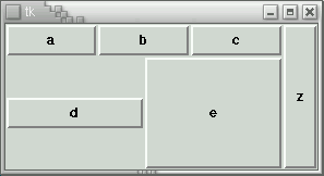
Q1. See if you can produce the following layout. When the window is resized horizontally, buttons a, b, c, d, and e should stretch but z should not. When the window is resized vertically, buttons d, e, and z should stretch but the others should not. Call me over when you've got it.
4. Widgets
Tkinter provides 15 kinds of widgets. For this lab, have a look at the following, and try them out.
- Examples of how to use buttons and a more comprehensive list of the options on a Button
- The Label widget, and a list of its options
- The Message widget is just like a label except that it can wrap multiple lines of text for you. See the options on Message widgets.
5. Menus
To create pull-down menus, you first create a Menu object
that is a child of the window.
This object will appear as a menu bar when you set the window's
menu option to this menu.
Then you create Menu objects that are children of the menu bar,
and they appear as pull-down menus.
Here are some examples of how to create menus.
6. Variables
Some widgets, such as the Scale, Entry, or Checkbutton,
directly represent data values.
It's useful to be able to get notified when those values are changed
by the user, and to update the widgets appropriately when those
values are set by the program.
The IntVar and StringVar classes take care of this.
IntVar objects store integers
and StringVar objects store strings.
Both kinds have a get() method to get the current value
and a set() method to set the value.
They also have a trace() method that lets you
specify a function to be called every time the value is changed
or even every time the value is read.
Variables are associated with widgets by setting the
variable or textvariable
option on the widget.
Here are some examples of using a variable with a Checkbutton.
The Radiobutton is similar to the Checkbutton, but provides multiple options instead of just a yes-no choice.
The Entry widget is a one-line text entry field, and here is a list of its options.
The Scale widget displays a slider and lets the user set an integer value; here are its options
Most of these widgets also have a command option.
For the Button, Checkbutton, and Radiobutton widgets,
this callback function is called whenever the user clicks on a button.
For the Scale widget,
this callback function is called whenever the slider moves.
The Entry widget has no command option.
Q2.
Create two sliders that always slide together
(if the user moves either one, the other one moves correspondingly too).
Use the command option to link the sliders.
Q3.
Create an Entry and a Label that are associated
(the Label should always display a copy of the contents of the Entry).
Use a StringVar to link them together.
(If you set a callback using the trace() method,
your callback should accept three arguments, but you can ignore them.)
7. Fonts
See this page
for a nice summary of how to use the 'font' option
to get the font you want.
The Button, Label, Message, Entry, Checkbutton, Listbox, Menu, Menubutton,
Radiobutton, Scale, and Text widgets all provide this option.
This week's assignment is here.
If you have any questions about these exercises or the
assignment, feel free to send me e-mail at
bc zesty
zesty ca.
ca.